
Estimated reading time: 8 minutes
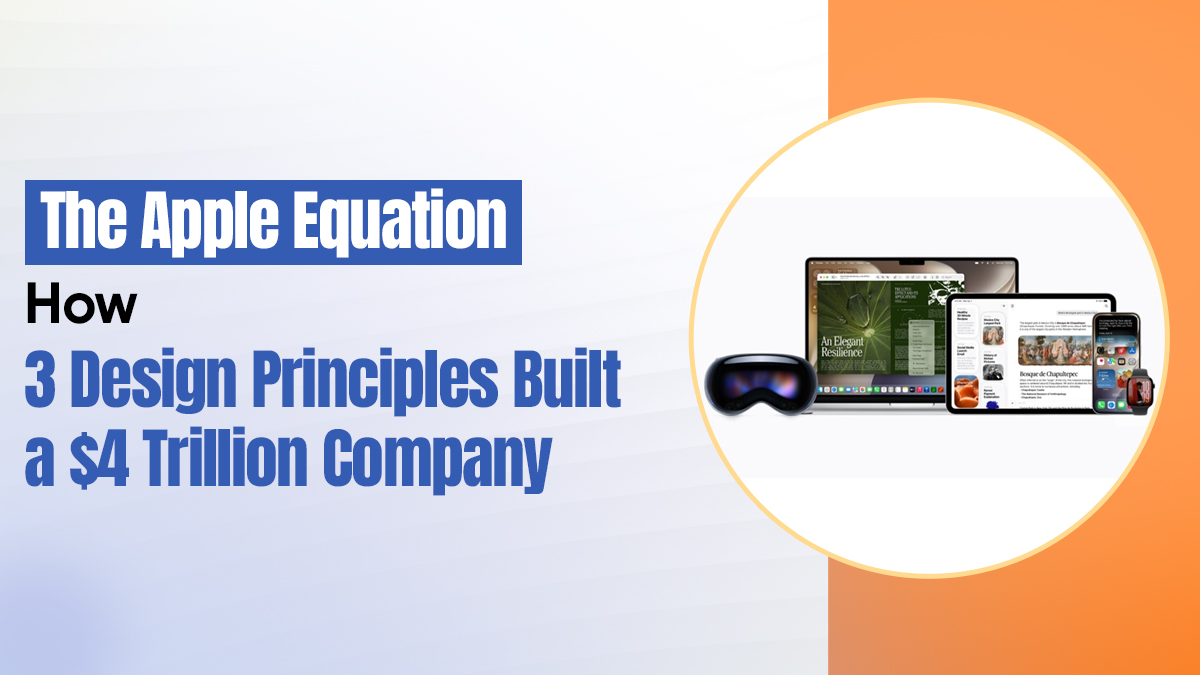
What Every Founder Can Steal From the Brand That Turned Simplicity Into the World’s Most Valuable Business
Most tech companies are in a constant race to add more
More features. More settings. More specs on the box. More reasons for you to choose them over the alternative. The logic is intuitive: more value should mean more customers
Apple mostly ignored that race
And somehow ended up worth over $4 trillion.
That is not a lucky outcome or a marketing miracle. It is the compounding result of three design principles that Apple actually believed in and actually stuck with, even when sticking with them was the harder, less obvious choice. Not principles written on a wall in a design studio. Principles embedded so deeply into how the company makes decisions that they show up in everything from a charging cable to a spatial computing headset
Understanding them does not just explain Apple. It offers every founder building something today a blueprint for the kind of clarity that turns a product into a category.
Before the Principles: The Question That Changed Everything
The rest of the technology industry spent the 1990s and 2000s asking: how do we make this more powerful
More RAM. Faster processors. More megapixels. Higher specs. The race was technical and the scoreboard was clear
Steve Jobs and Jony Ive were asking a completely different question.
How does using this actually feel
That shift, from engineering-first to experience-first, from what the product can do to what it feels like to do it, is where the entire Apple story starts. Not with a product. With a question nobody else thought was the right one to ask.
Principle One: Simplicity Is the Hardest Thing to Build
The first thing Apple became obsessive about was removing things
Not simplifying in the way that word usually gets used, which is to say, making something easier to understand by dumbing it down. Removing the things that stand between a person and what they are actually trying to do. Every button, every color, every moment of empty space on an Apple screen is present on purpose. And everything that is not there is just as intentional as everything that is
Open the Calculator app on an iPhone. It is boring in the best possible way. It does exactly what you need, nothing more, with no decision fatigue built into the experience. You do not spend a moment wondering what anything does. You just use it
The insight behind this is genuinely worth sitting with: people do not want more options. They want the right option to feel obvious. When you remove friction, something remarkable happens. The person stops thinking about the tool and starts thinking about what they are doing with it. That is where real satisfaction lives
For founders building products or services in any category: the question worth asking before every feature decision is not “what can we add?” It is “what can we remove and make the experience better by its absence?
That discipline is rarer and more valuable than almost any feature you could ship.
Principle Two: Technology That Feels Like It Already Knows Yo
The second principle is harder to name but easier to feel
Apple calls it intuitive. A more precise description might be: familiar from the very first moment
When you drag a file to the trash, you already understand what that means before anyone explains it. When you swipe through photos, it feels like flipping through actual photographs. These are not accidental design choices. They are deliberate anchors to things people already understand, built so that the learning curve practically disappears on first contact
The haptic tap when you press a button. The smooth animation when an app opens. The way your iPhone’s weather app shows you the exact sky outside your window right now, rather than a generic icon. None of this is technically necessary for the function to work. All of it builds trust. And trust, sustained across thousands of small interactions, is what converts a satisfied user into a loyal one
The Dynamic Island is the clearest recent example of this mindset in action. Apple had a hardware problem: a cutout in the screen for the front camera and Face ID sensors. The industry’s default response would have been to hide it, shrink it, or apologize for it with a software workaround. Apple made it interactive. They turned a physical constraint into a living part of the interface, one that surfaces notifications, tracks ongoing activity, and responds to touch in ways that feel natural rather than engineered
In 2025 and into 2026, with Apple Intelligence now embedded across iPhone, iPad, Mac, and Apple Vision Pro, this principle has extended into AI. Apple’s approach to artificial intelligence is not to make intelligence visible and impressive. It is to make it invisible and useful. The AI surfaces the right information at the right moment without asking you to understand how it works. The experience feels less like using a tool and more like being understood by one
For founders: the experience your customer has in their first sixty seconds with your product will determine more about their long-term relationship with your brand than almost anything that comes after. Make those sixty seconds feel inevitable.
Principle Three: The Ecosystem That Makes Leaving Feel Like Loss
The third principle is the one that Apple rarely discusses directly, and it is the one that probably makes the most enduring business sense
Everything works together
Your AirPods switch seamlessly between your iPhone and your Mac without requiring any input from you. Photos taken on your phone appear on your laptop before you have opened a single app. A message you start composing on one device continues on another. With Apple Intelligence now running across the entire ecosystem, context moves with you in ways that feel less like software synchronization and more like the system understanding your life
The effect is so smooth that most people stop noticing it. Which is exactly the point.
This is not lock-in in the cynical sense that the word usually carries. It is convenience compounded to the point where switching feels like a genuine sacrifice rather than a neutral choice. Every Apple product you add to your life makes the other ones you already own slightly more valuable. The effect compounds. The relationship deepens. And the loyalty that results is not based on contract terms or switching costs. It is based on a system that has become genuinely woven into how someone lives and works.
People do not stay with Apple because they are trapped. They stay because leaving would mean losing something real that they built over years: their photos, their muscle memory, their workflow, the quiet reliability of everything working together without them having to manage it
For founders: the most durable customer relationships are built not on the product alone but on the system the product belongs to. What does your product make better when someone also has something else you offer? What does it connect to in their existing life that makes removing it feel like a real loss? Build for that integration, and you build something that compounds in value the longer someone stays.
What Any Founder Can Actually Take From This
Apple’s specific path is not a template that copies cleanly into another industry or another company. The scale is different, the resources are different, the history is different
But the three principles translate clearly
Start with the human problem, not the technical challenge: Not the market gap, not the competitive opportunity, but the actual friction a real person is living with every day. Then remove everything that does not help solve it
Build for the feeling, not just the function: The experience of using your product, the trust it builds through small, consistent, well-designed moments, is the actual product. The technical specifications are the supporting evidence
Design for the system your customer lives in, not just the moment of use: The more your product integrates with the other things in someone’s life, the more valuable it becomes to them, and the more genuinely difficult it becomes to imagine replacing
Apple went from near bankruptcy in 1997 to a $4 trillion company in 2026. The specs were never the reason. The experience was. The ecosystem was. The obsessive, patient discipline of removing everything that did not serve the person holding the product was
“Design is not just what it looks like and feels like. Design is how it works.” Steve Jobs
That sentence contains the entire playbook
Not how it looks. Not how it is marketed. Not how it performs on a benchmark
How it works in the hands of the person it was built for?
That is the question that built a $4 trillion company. And it is available to every founder willing to make it the center of every decision they make.
At Believers Destination, we believe the most powerful competitive advantage any founder can build is a product that makes the person using it feel like it was designed specifically for them. Apple did not achieve that with more. They achieved it with less, done more intentionally. Start there.
![]()